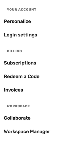
Hi, I like the UI of Answerly but one small thing that bothers me somewhat is the menu alignment ![]() I know not a priority but still. Attaching a screenshot below. Basically Main heading and subheading starts with different spacing.
I know not a priority but still. Attaching a screenshot below. Basically Main heading and subheading starts with different spacing.
Thanks, I have changes the topic to feature request we will probably at one point review the dashboard options and I can’t confirm this but maybe there will be some design changes and we will keep your advice in mind. Thanks
1 Like
